Richard Robinson OUGD301 | Summative Evaluation
Initially I went into this module thinking I knew what I wanted to develop as a designer and what I thought I wanted to specialise in. My rationale was to look at ways of brand promotion through illustration and motion. Illustration has definitely been something I’ve aimed to use throughout my projects however motion did take a step back.
Within my first brief, I aimed rebrand a fictional store, to create a new image to a younger market. First thing I will never do again is completely make up a brand and then propose that there is something wrong with it? I don’t know what I was thinking with this but what I learnt from it was that in making a decision like this the brief is blown wide open. There’s no research that allows you to understand the underlying problem. This is what I believe ultimately made my first brief loose all focus and actually really dragged it out into a pain of a project.
The brief itself turned more into an investigation on developing illustrative and on screen processes rather than solving a problem, something that can be said for other briefs as well. The main issue I came across with brief one in general was poor time planning, through not creating self deadlines. This allowed the on screen faffing to go on and on, which eventually started to move away from solving an actual problem.
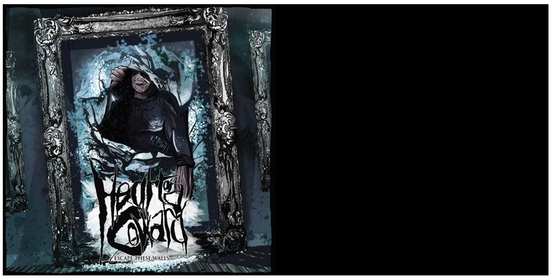
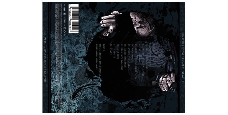
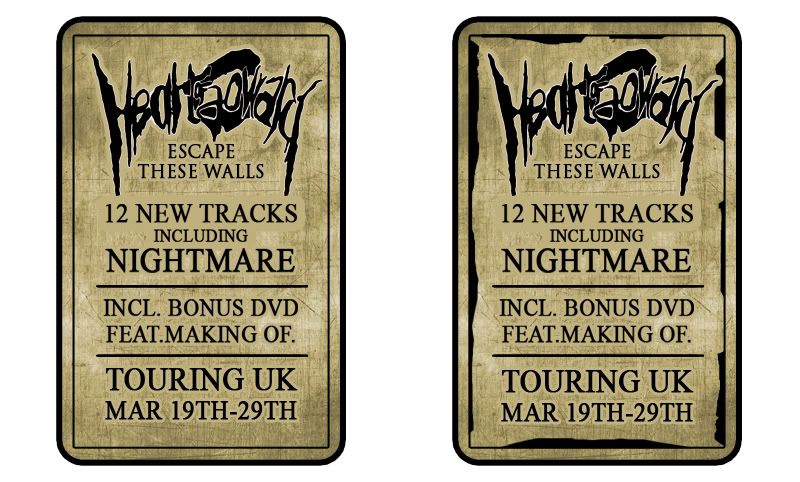
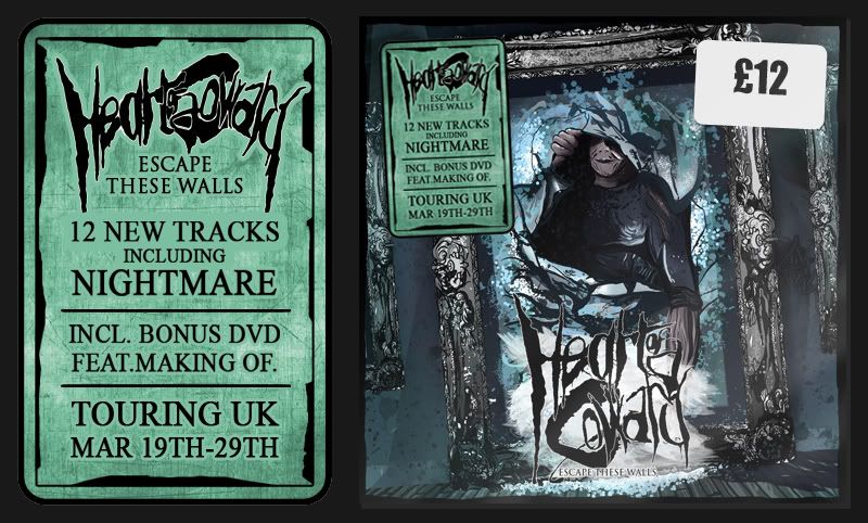
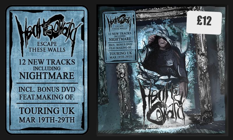
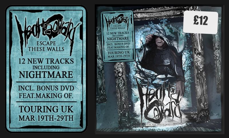
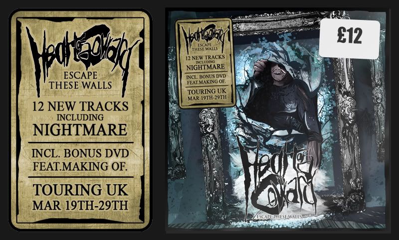
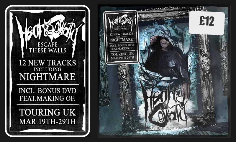
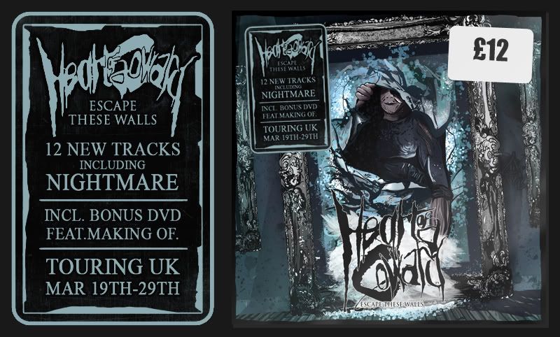
Brief two in my opinion is the only project I can say solves a problem. I had a band that needed a new album cover and method of promotion. It was a solid tangible brief that was great to research, great to understand and carried a clear thought process for me in order to solve the brief. In comparison with brief one I think this is what made the brief more of a success and also created a more solid resolution.
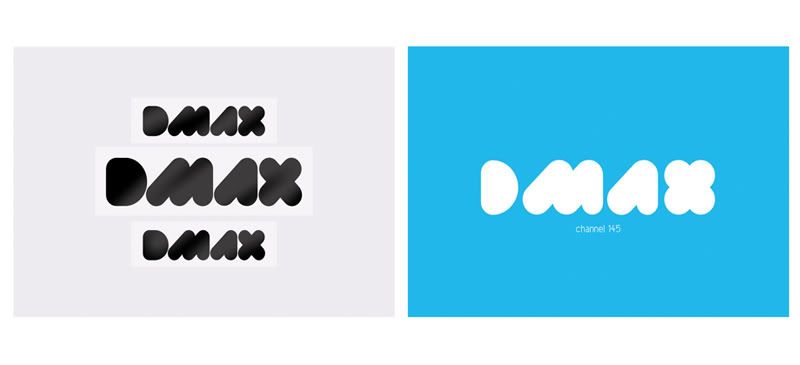
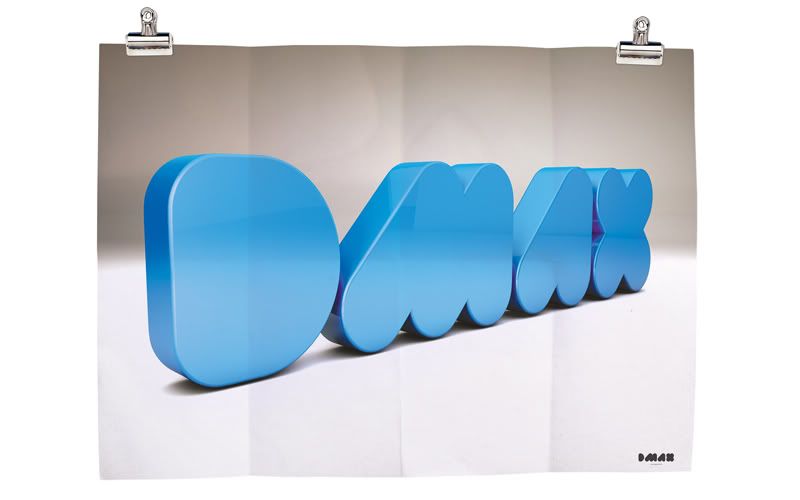
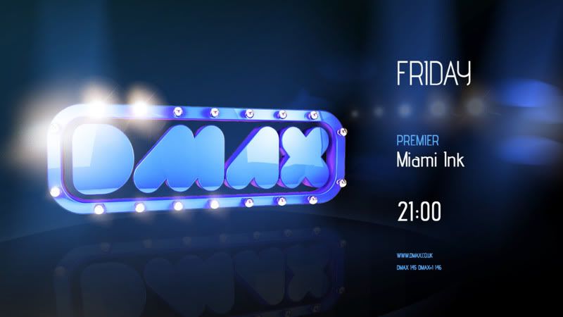
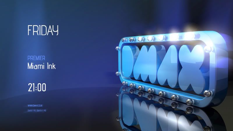
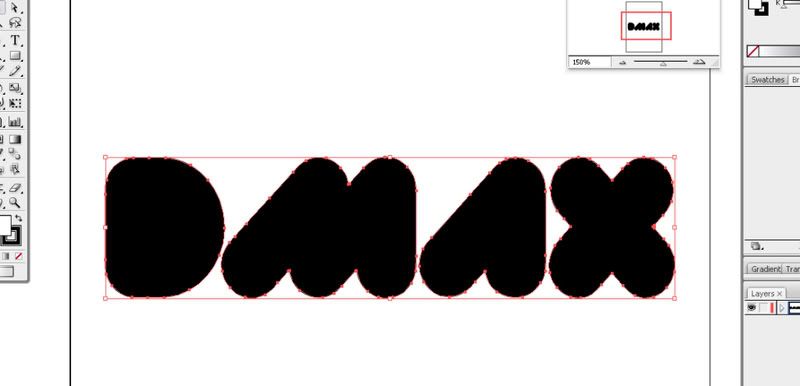
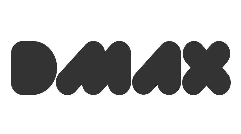
Brief three was to look at ways of rebranding the Television Channel, DMAX. As I was so far going against my rationale, I wanted to include the video aspect that I was initially interested in. However by this stage time was against me and I had to create a quick turn around with the brief. To aid the production of my six video intros, I decided to create a campaign that could run a main structure that could be manipulated to work across the six platforms.
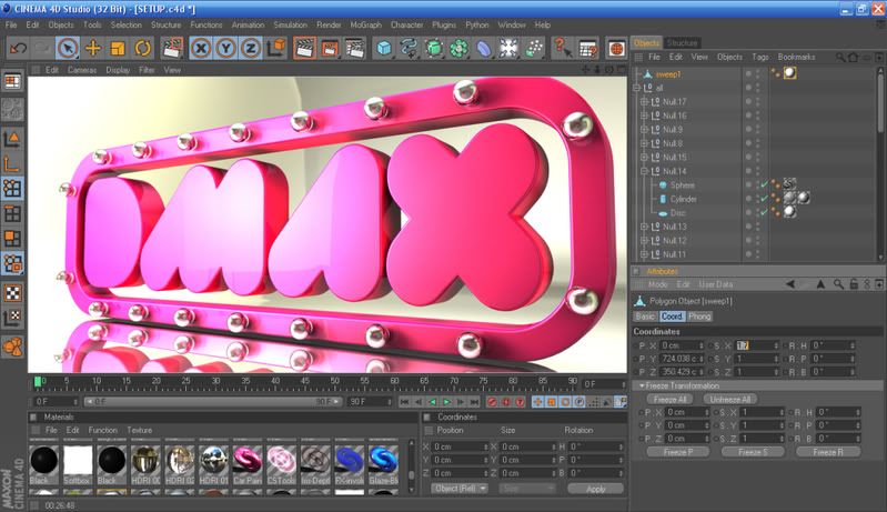
The challenges I came across with this brief, was again starting to feel like an investigation into software. I wanted to expand on my knowledge of Cinema 4D as I could see the potential of the software and how it could aid my studies. The main challenges I came across was the time that comes with learning software and the practice that has to be undertaken. Another issue was the speed of rendering 3D animation, as this soon became a large issue, with 25 frames taking up to five or six hours to complete. Further research and testing then had to be taken into reducing rendering times and looking at ray depths and lighting. Testing was one of the main factors that came with this brief.
The idents as a whole are not my strongest work by far. What I can take from this experience is the knowledge that if I do have to plan a project like this again, hopefully I will have picked up a few tricks but also, I’ll know how to better allocate time for areas like testing which I never really planned for. Really did see that there’s not a YouTube video for everything.
The Feel Good drinks brief was a quick turnaround project that needed a simple message. Rather than looking at re-marketing an extensive range of products, I chose to focus on the brands least successful product, the 750ml Sparkling Juice Drink. Working for Asda’s Home Delivery service, I was lucky enough to get hold of some selling figures for the brands range and more importantly look at which type of customer was purchasing.
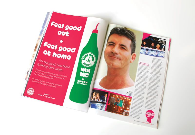
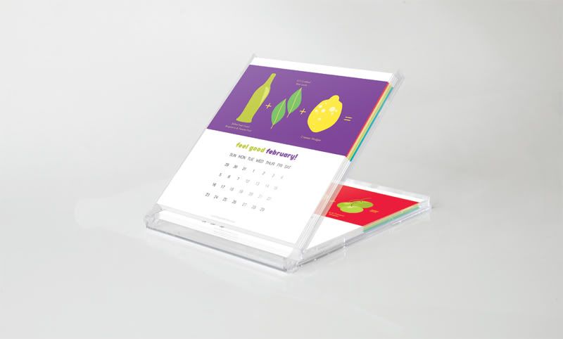
The problem I found was that people struggled to know what the 750ml bottle was all about. Was it a mixer or a premium straight drink? I aimed to show that it could be both with the ‘Beautiful Blends Cocktail Calendar’. The calendar would be supplied in a compact CD size format and sent out as a mailer with a different ‘simple’ mixture each month, keeping the brand in the heads of consumers all year round. The idea was nothing new than what’s been done before but I was happy enough with the resolve as it was done in such a short time. The campaign was reinforced with a single page spread, web page and coaster design for pubs and clubs.
In general the last month running up to deadline has been a constant push. It’s led to extremely fast decision making that’s sometimes worked and sometimes not, taking me back to the drawing board but overall I think this could and should have been avoided. Time management is always something I think I’ll have an issue with. What I NEED to do in all future work it so set self deadlines and more importantly, meet them.
Wednesday, 14 December 2011
Feel Good Drinks - Concept
The Feel Good Drinks | Beautiful Blends - Cocktail Calendar
Concept Development
Concept Development
Feel Good
The problem I found was that people struggled to know what the 750ml bottle was all about. Was it a mixer or a premium straight drink? I aimed to show that it could be both with the ‘Beautiful Blends Cocktail Calendar’. The calendar would be supplied in a compact CD size format and sent out as a mailer with a different ‘simple’ mixture each month, keeping the brand in the heads of consumers all year round. The idea was nothing new than what’s been done before but I was happy enough with the resolve as it was done in such a short time. The campaign was reinforced with a single page spread, web page and coaster design for pubs and clubs.
Final Boards - DMAX
***************
***************
***************
***************
***************
***************
***************
***************
***************
***************
***************
***************
***************
***************
***************
***************
***************
Mailout
Screen Splash
Final Idents
It does seen a bit of a jump here from what I've been working on to final work, so I'll just explain. The developing of these 5 second shorts was done on screen with the information from my story boards.
Each video below is annotated seperately with information on the decision making that was made throughout the process.
The item that is used throughout these videos is the logo and backing. This is something that appears on all 6 videos, becoming the key feature of the videos. The underlying difference in these idents is the realtion to the shows through imagery and audio, something that will be discussed in greater detail below.
Background Test
Test Idea that was later discarded. Taken from an idea used on a story board of having buildings popping up etc. Really didnt work on screen.
*********UPPPPPPPPPPPP*****************
*********UPPPPPPPPPPPP*****************
*********UPPPPPPPPPPPP*****************
*********UPPPPPPPPPPPP*****************
*********UPPPPPPPPPPPP*****************
*********UPPPPPPPPPPPP*****************
*********UPPPPPPPPPPPP*****************
*********UPPPPPPPPPPPP*****************
*********UPPPPPPPPPPPP*****************
*********UPPPPPPPPPPPP*****************
*********UPPPPPPPPPPPP*****************
*********UPPPPPPPPPPPP*****************
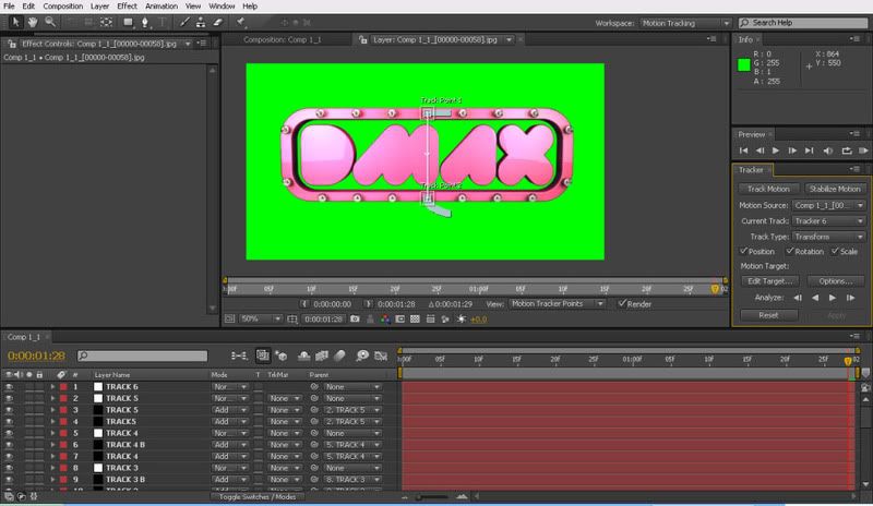
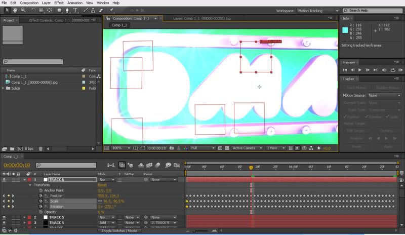
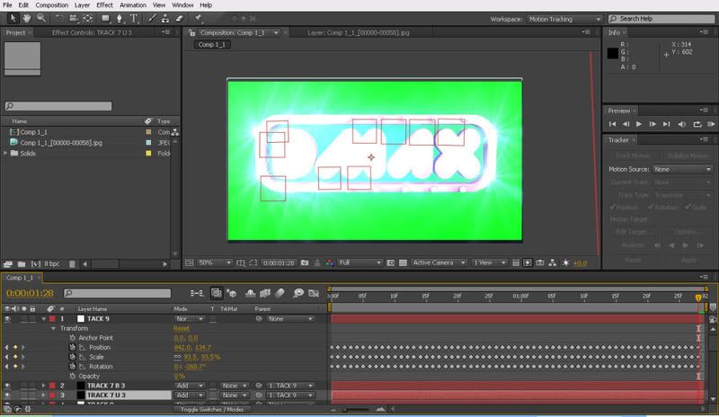
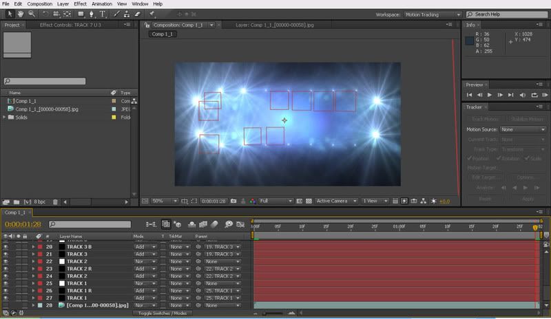
Motion Tracking in After Effects
Well this was fun.. I won't go into the agonising frustrations that went into creating this but lets just say, I know for next time.
The track is based on two points duplicated over. So one light on ones side is linked paralel to the other and this is reoeated over the light sequence. The tracks are followed by a null object with the tracking information embeded which is then linked to the lighting plugin.
The light is then tracked up to each point and lit on a sequence to give the effect of the light lighting in a revolving animation around the border. Not the best explination I know but hopefully you get the idea.


The Trickier Bits
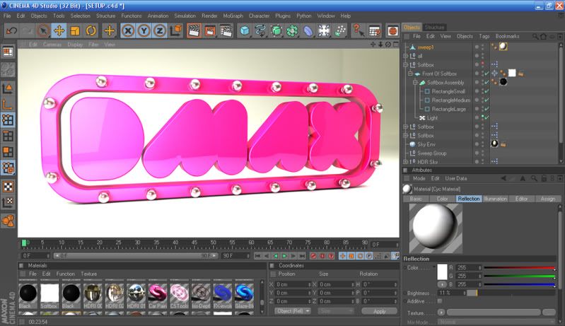
To get the lights to animate the object I decided to do this in After Effects using a great lighting plugin called Optical Flares. Chose to use this is as it's generaly given some nice realistic results in past projects.
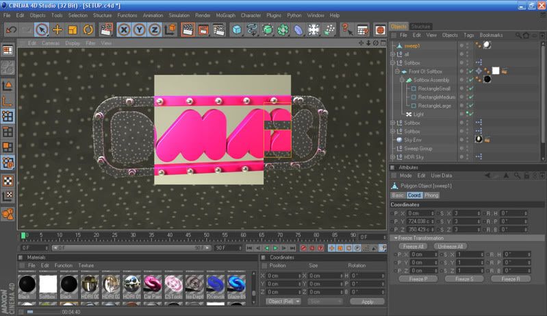
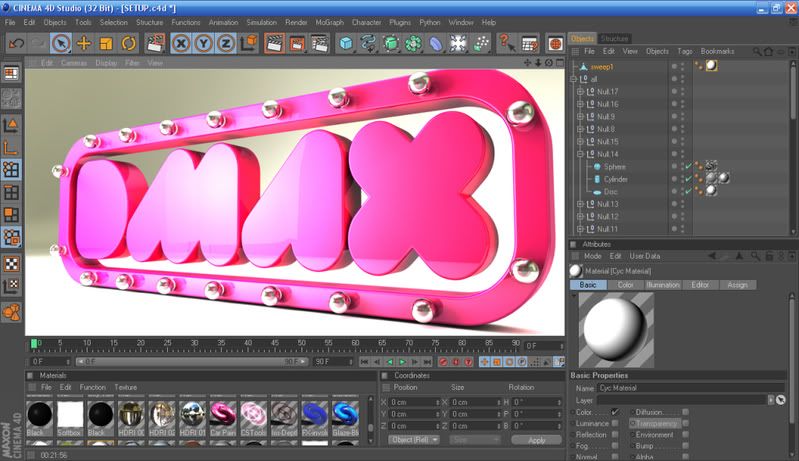
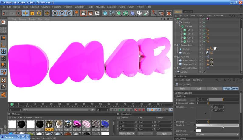
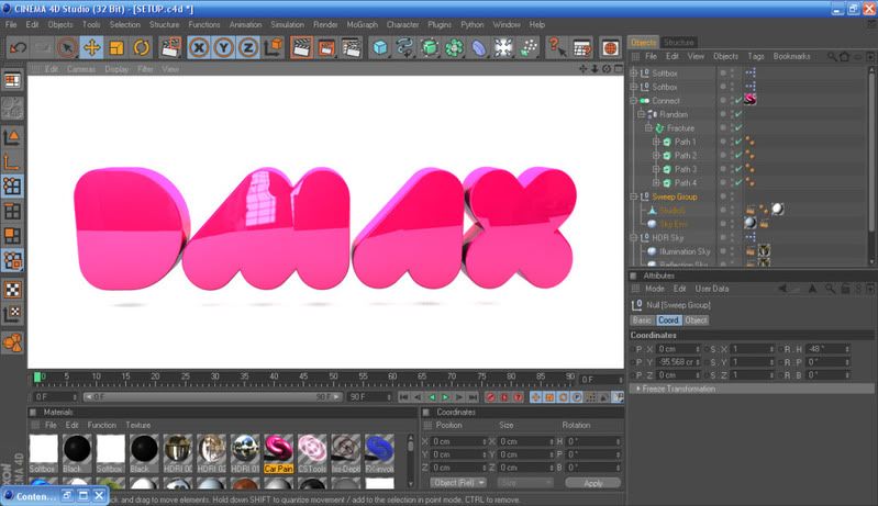
The issue with rendering out in C4D was rendering with transparency and alphas. From what I knew and what I was researching on the net I couldnt see a way of doing it. I needed the logo model to have transparency as a given. Without it, the project would have pretty much finished here because I needed the logo model to be animated in C4D and the backing to be created in AE.
Anyway, to get around this I started looking at green screening and how it can be keyed out in AE. This led to an annoying ammount of faffing with cinema trying to get a flat green background that - doesnt reflect green all over the object and lights evenly enough to be masked out. Annoying enough, it was later into the project I was watchin a completely unrelated video tutorial which briefly mentioned using the compositing tag to create a matted object out of the layer. This solved the problem as you could also hide the object from rays and lights.
The footage was rendered as a JPEG sequence as I was having some issues with this ever reliable desktop PC locking up on me. Rendering jpegs allowed me to pick up after where it messed up (which it actually did). Saved me waiting another 4hours.
Rendering this as a whole was actually extremely demanding on time. Running a high quality render with good settings took over 5hours to render 26 frames. This was later stopped and rendered in a much lower quality setting as seen in the ISSUU above. Total render time came in at around 4hours total.
Image of the higher quality render settings below,
Colour Variation
Quick Variation of colours with Hue Changes. Terrible quality, just aimed as a quick test for rendering out other colours in C4d
Finished Test Reneders
Border Prep
Creating the border for the lighting set to be used on the ident concepts seen within story boards.
Dark Backgrounds
Tests to see how well the logo would work on dark backgrounds with use of colour and lightlng.
Saturday, 10 December 2011
Friday, 9 December 2011
Thursday, 8 December 2011
Monday, 5 December 2011
Promotional Material | Merch
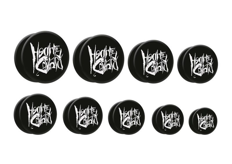
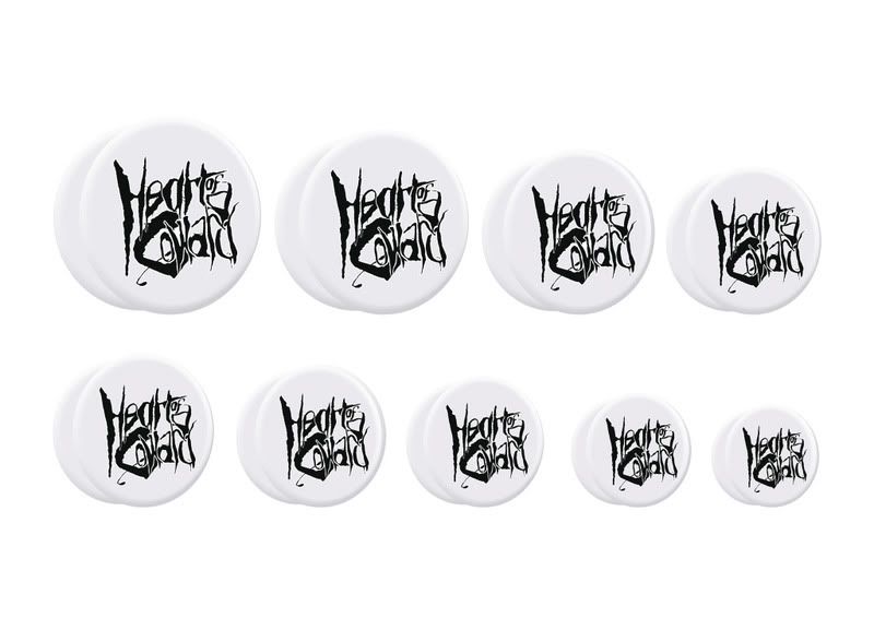
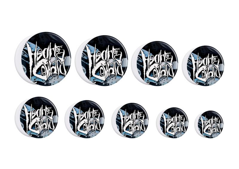
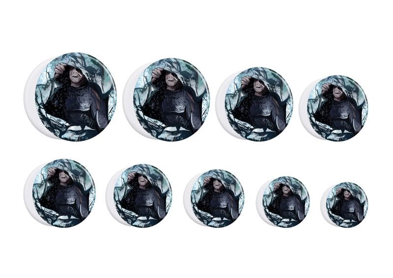
The idea behind this was about tapping into the audience and finding a new relevant way of promotion through mechandise. The concept for creating a range of jewellery based products in the form of stretched ear plugs was created with the idea of creating something new within the current market.
The concept of using any band material, logos and or album covers is not currently in place but it seems a little strange why it isnt, as my research I carreid out proved it would be an appealing concept.
The plugs were based around the artists new logo and the features off the album cover. The surface area ranges from 8mm diameter to 24mm, the most popular sizes within this market.
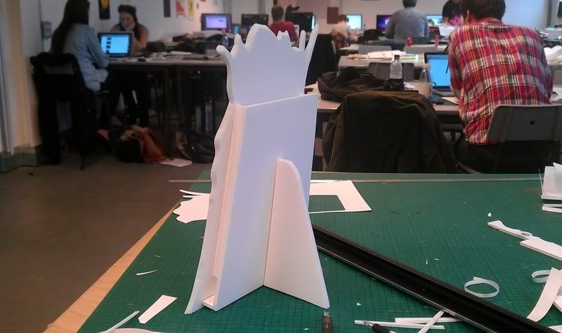
A POS was created to house the product, which has an intended use on store counters and jewellery stores.
Initial Ideas taken from my finished range:
Final Images for Plugs:
Stand / POS Development
Final image shows the use of the gold picture frame, this idea was soon scrapped.
Crafting the Mock Up
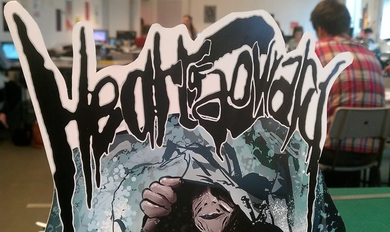
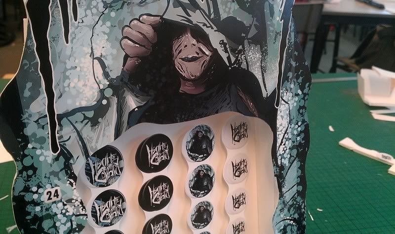
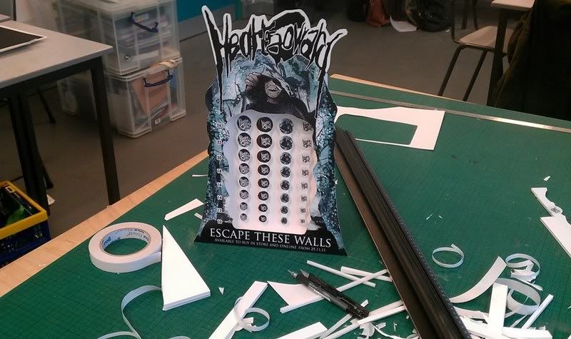
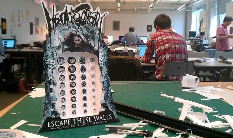
The concept of using any band material, logos and or album covers is not currently in place but it seems a little strange why it isnt, as my research I carreid out proved it would be an appealing concept.
The plugs were based around the artists new logo and the features off the album cover. The surface area ranges from 8mm diameter to 24mm, the most popular sizes within this market.
A POS was created to house the product, which has an intended use on store counters and jewellery stores.
Initial Ideas taken from my finished range:
Final Images for Plugs:


Stand / POS Development
Final image shows the use of the gold picture frame, this idea was soon scrapped.
Crafting the Mock Up


Thursday, 1 December 2011
Promotional Material | Poster & Flyer
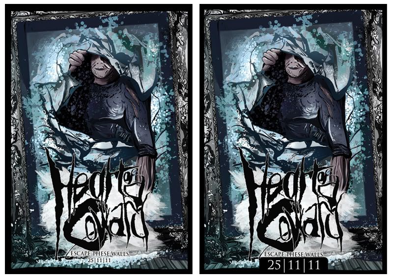
Poster ideas based off the album cover. As seen in my research the album cover is what people are looking for in store, so if this is seen on the poster, this is what a possible customer will be looking for. Album art is nearly always used for music based promotional posters.
What I found most was that the more I was adding to these the less effective it was becoming so I've stripped it back to the artwork and included the albums release date. As a promotional poster this should communicate the idea well and be effective as a piece of design.
Poster Format (LEFT) 250x360mm
Flyer Format (RIGHT)

Biography Booklet
Included with the Special Edition pack. The booklet was mostly developed on screen so as for development I unfortunately have little to show. The booklet was created using imagery and information collated as part of my initial research. The images were small in px so some alterations and smoothing were made prior to print. The issuu document is below and the final booklet was printed onto 80gsm double sided matte.
Prints
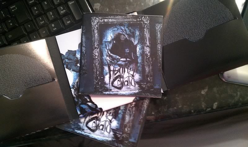
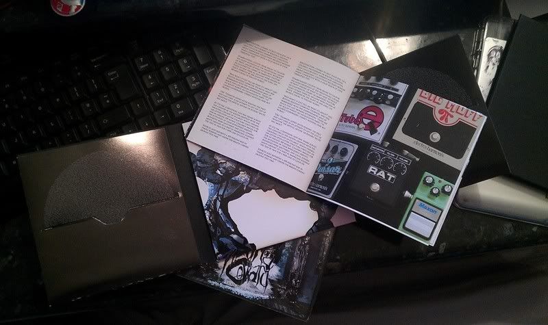
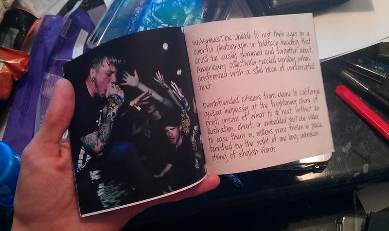
As always, final imagery coming soon.
Prints


As always, final imagery coming soon.
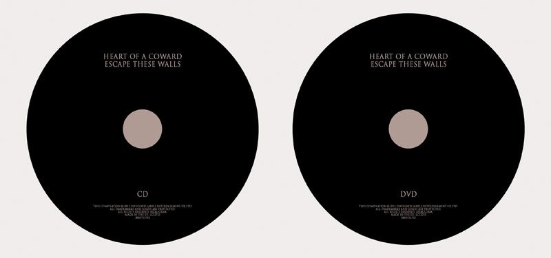
Disc Layouts
SE Sleeve Wrap Around
The Special Edition sleeve is exactly the same as the inside cover with only a slight difference so no need to jumb back into designing, just a bit of measuring.
As I was saying a lot in my research the cut out sections I was seeing on various packaging became really appealing to me and with the type of image I had available I couldn't help but make this item.
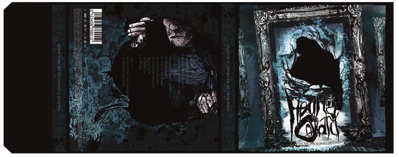
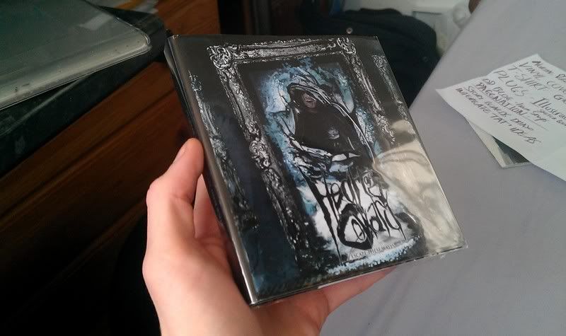
As said a bit below, better photography coming very soon in a seperate post :)
As I was saying a lot in my research the cut out sections I was seeing on various packaging became really appealing to me and with the type of image I had available I couldn't help but make this item.


As said a bit below, better photography coming very soon in a seperate post :)
Screen to Print | Material Testing
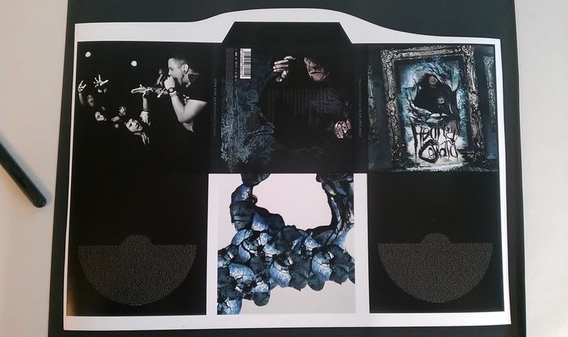
Printing the double pack -
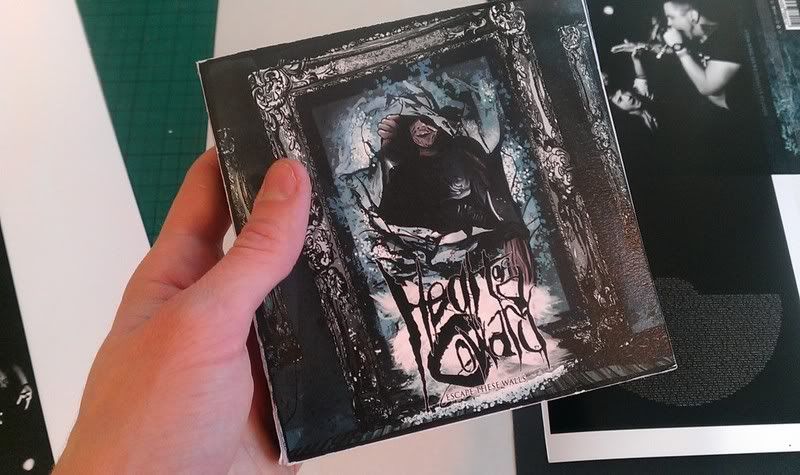
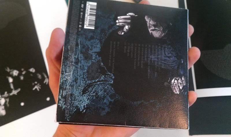
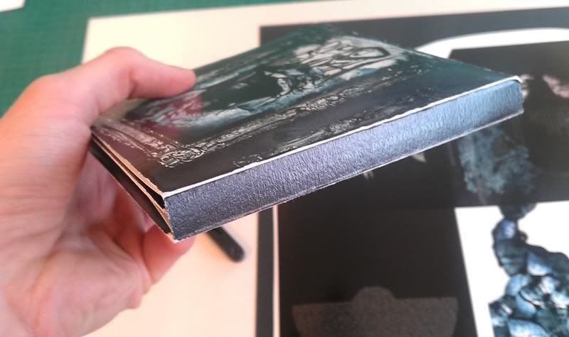
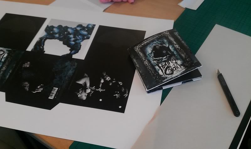
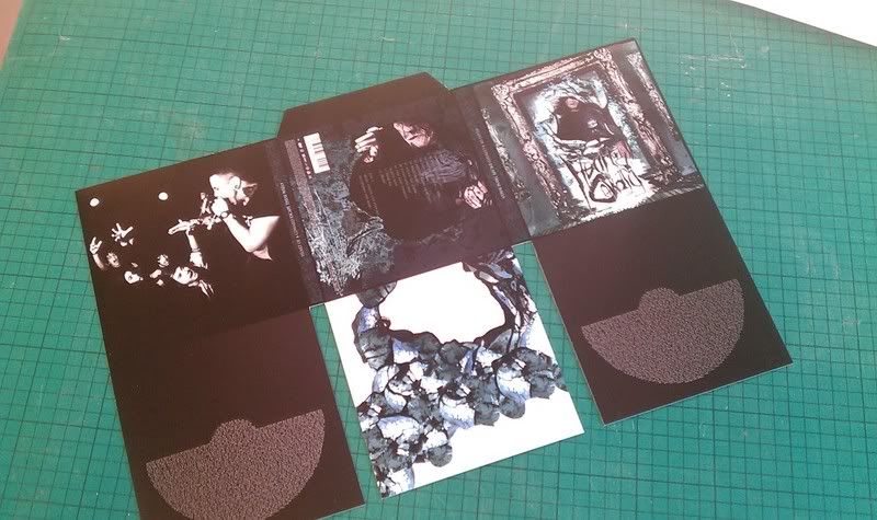
Finding the right kind of material was pretty difficult when it came to this. I needed a thick enough weight to make it solid with a good print surface, something which doesnt seem to go hand in hand down in digital print. For the first test I did a 320gsm print which was a nice weight but came with a rough texture which made the ink bleed, creating a loss in detail. As a really quick mock up I lightly cut the edges and folded it together. Later on I would obviously crease the material but for a quick test this did the job. Pictures of that below,
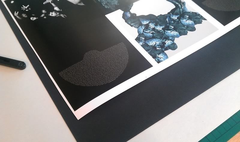
So to try a few other things I printed the net onto Matt, gloss, satin, and matt with a single laminate. What I found with Matt was that with my cover being quite dark, the darker tones become a dark grey which didnt give the right finish I needed as the tones ceased to pop. Gloss was far too light happy and reflected so much it wasn't really working however satin gave a nice inbetween with great colour depth and reflectivity. The single side laminate seemed like a good idea as it makes the material more pliable and the surface is protected. Although the laminate had to be over matt so the tonal issues on blacks was back so it was scrapped as a possibility.
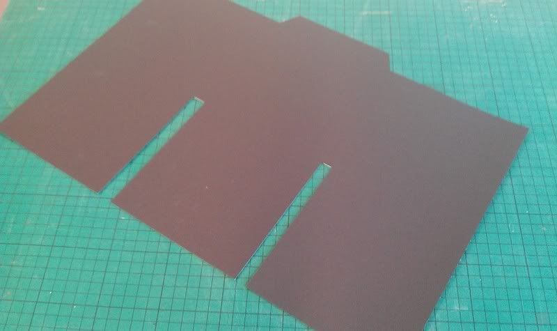
As much as I like the Satin the material was far to fin and in tests showed to be too flimsy to house the CD's. To get around this and thicken the material I used some black card, mounted onto the Satin sheet. This was working far better. If anything it became JUST slightly thicker than I had maybe wanted but it was the closest I'd been able to achieve to existing products so far.
Finshed Photographs will be uplaoded in a seperate post once everything's complete, such as the labels for this item.
Finding the right kind of material was pretty difficult when it came to this. I needed a thick enough weight to make it solid with a good print surface, something which doesnt seem to go hand in hand down in digital print. For the first test I did a 320gsm print which was a nice weight but came with a rough texture which made the ink bleed, creating a loss in detail. As a really quick mock up I lightly cut the edges and folded it together. Later on I would obviously crease the material but for a quick test this did the job. Pictures of that below,


So to try a few other things I printed the net onto Matt, gloss, satin, and matt with a single laminate. What I found with Matt was that with my cover being quite dark, the darker tones become a dark grey which didnt give the right finish I needed as the tones ceased to pop. Gloss was far too light happy and reflected so much it wasn't really working however satin gave a nice inbetween with great colour depth and reflectivity. The single side laminate seemed like a good idea as it makes the material more pliable and the surface is protected. Although the laminate had to be over matt so the tonal issues on blacks was back so it was scrapped as a possibility.
As much as I like the Satin the material was far to fin and in tests showed to be too flimsy to house the CD's. To get around this and thicken the material I used some black card, mounted onto the Satin sheet. This was working far better. If anything it became JUST slightly thicker than I had maybe wanted but it was the closest I'd been able to achieve to existing products so far.


Finshed Photographs will be uplaoded in a seperate post once everything's complete, such as the labels for this item.
Subscribe to:
Comments (Atom)

