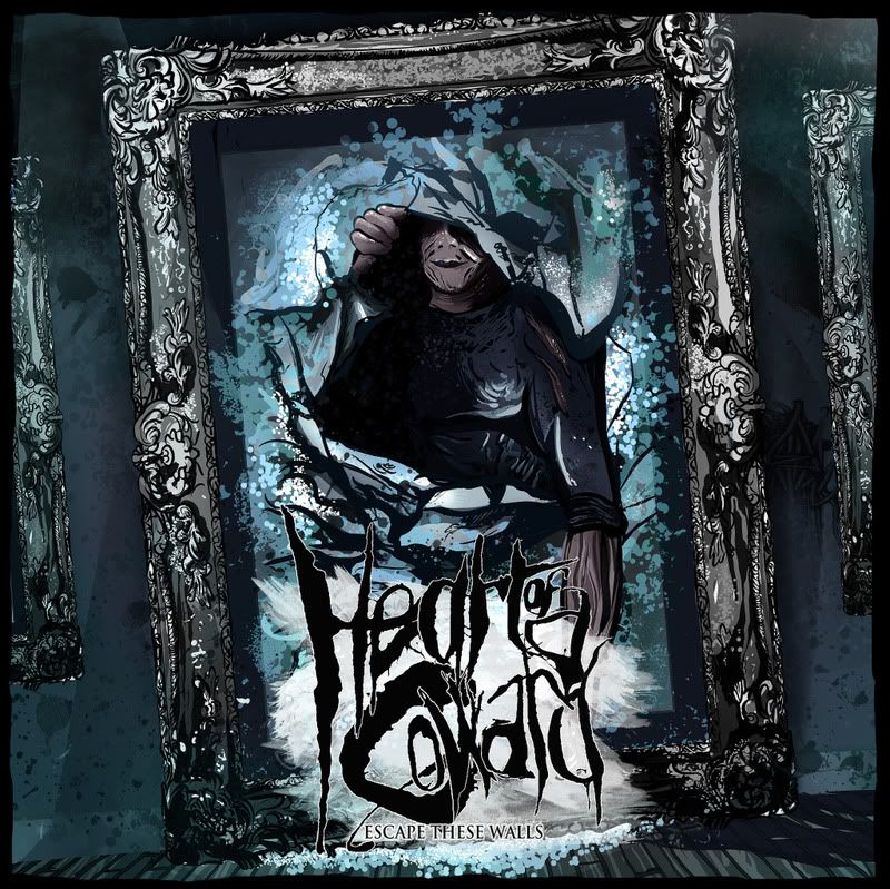
Now that I had this idea I began to plan ideas of creating this as an image. To make this a little clearer I wanted to set the image in an art gallery style back drop. Rather than making up my own idea of what this would look like I took a look around Leeds art Gallery (documented on DC) and sourced various imagery from the net.
With this in place I then began on the idea for how the to have our character bursting though a frame. I started sketching out ideas which were beyond rough and actually quite difficult to create mainly because of trying to imaging how paper reacts and creases in an action of being broken.
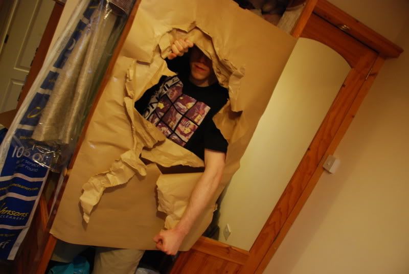
To solve this I got hold of some large sheets of paper and a mate with a wardbrobe. The pictures below show what I'm getting at. If it's taking so much time to illustrate one angle, why not just mock up the idea and photogrpah 100 outcomes in less than an hour. The images then later set the ground for sketch overs in PS. The process of doing this was invaluable really as I was able to pan around and look for what would work/suit best the proposed concept.
Initially the set up was looking a little flat at first and I wanted to try include a little more shadowing so we ended up using two layers to offset the look a little and created some more interesting light fall off.
The set of images below were the ones I was finding more useful.
The style of pose I was wanting wasnt something agressive. I think in general theirs an idea that the hardcore genre is all about aggresion and power but to me that's a little sterotypical and very un-true. The positioning I was after was more of a casual, stepping out style. Not smashing through with a big face screaming at the viewer from the front cover. I think something like that would appear cheap and uninteresting. I also thought it was important to hide the eyes, just to add a mysterious feel about the character.
A range of possible concepts were then created from the images I was favouriting. What I thought was important was to start working within a square format to see how these work within context of a cover. I also included the typeface to see how everything could work together.
Gallery Concepts
Here's the main image that was taken forward for futher development:

Image for the trace and sketch overs,
Further edits/Colour
Final Colour changes to end results
Final Edit


No comments:
Post a Comment