To get my mind into the workflow I started looking back at my DC posts on existing album art. From this, using the band title I started to imitate the styling of each range of type to see how the text was working. What I found with most was that the logo and album title were more so based on existing fonts with some grungy splattered effects masking out areas to grit them up a little. Knowing that my approach to the art direction will be illustrative based and work with the idea of a hand rendered finish I wanted to avoid existing type.
Taking inspiration from the album titles I'd collected I started sketching out some ideas. I orgionally wanted to choose a nice hand rendered style appose to working on Photoshop but I didnt't want to have this sudden jump to a style so here's some variation in style.
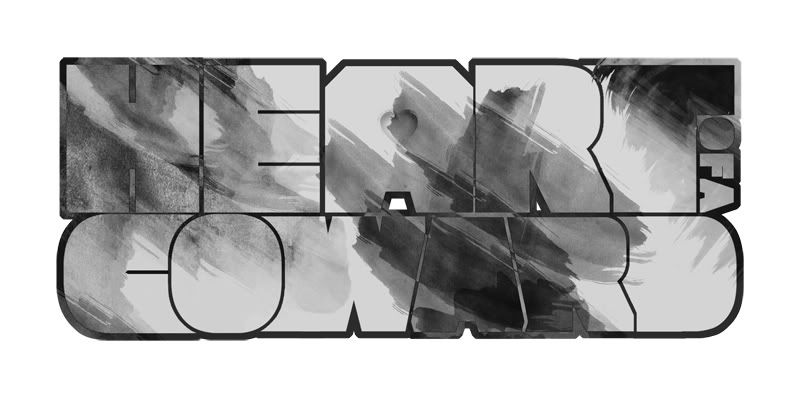
I was starting to get a little bored of pencil and PS based work so I went a little further into my DC posts to recap on the ideas I'd seen with inking and woodcuts. With this in mind I bought a small pot of ink and started sketching with the nearest pointy object I had to hand, a plastic fork.
The first few images in this issuu are a little ropey but it was my first time using inks really so it took a bit of getting used to. Normally I wouldnt include these but I guess it's development.
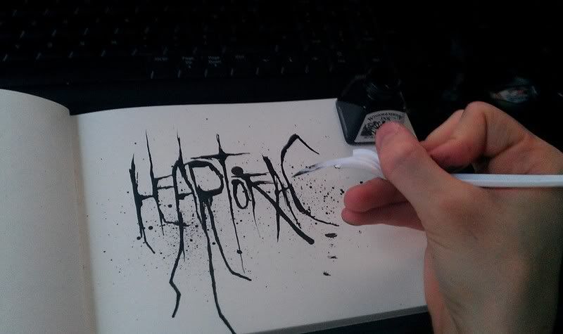
Was also trying a few other random objects for my scratchy effect like a sewing needle and bits of card
More ideas from sketch book:
I was really liking the effect the ink was giving but I needed to try and experiment more in the layout of my type and not just test the inking methods. It the text was all sitting on one time I realised that I'd have to centre up my text on the album for it to look right. But what with the length this could cause difficulty with my illustration as I've now effectivly lost a nice chunk of space at the top. The idea below is a development from two of the tests shown about in my issuu binder.
Origional Sketch
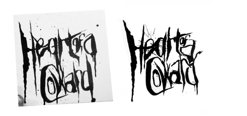
In this image it shows a bit of a comparison off the origonal sketch to what I started working with. There was a lot of features that I really liked in other inkings I did and sinse I wasn't quite happy with the lettering in this image I started piecing out sections I liked that multiple other drawings to get this hybrid version if you like.
Thick/Thin Versions
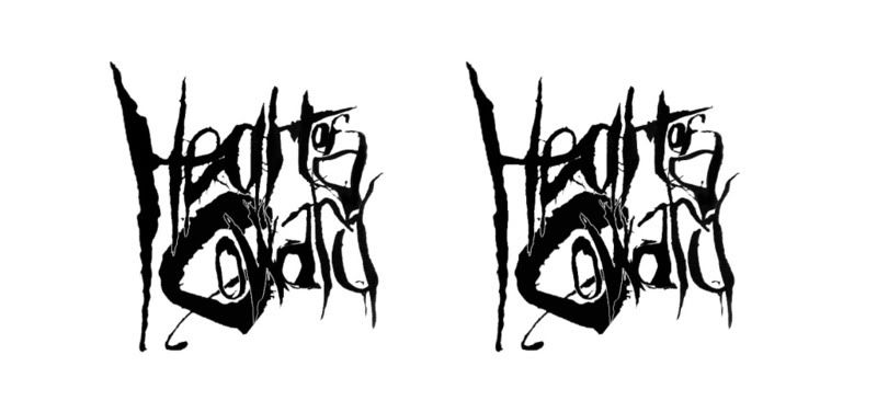
Was liking the stage where I'd gotten to now but I was making these edits from tiny JPEGS taken with my phone and the quality wasnt great. To fix this I sorted out a quick trace of the image (actually traced it off my monitor.. wouldnt recommend) and re-inked it by hand to re gain that hand crafted feel and get rid of that polished look.
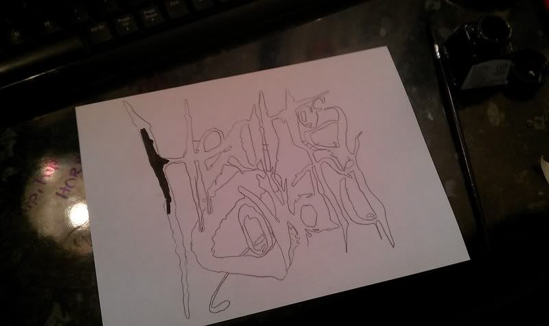
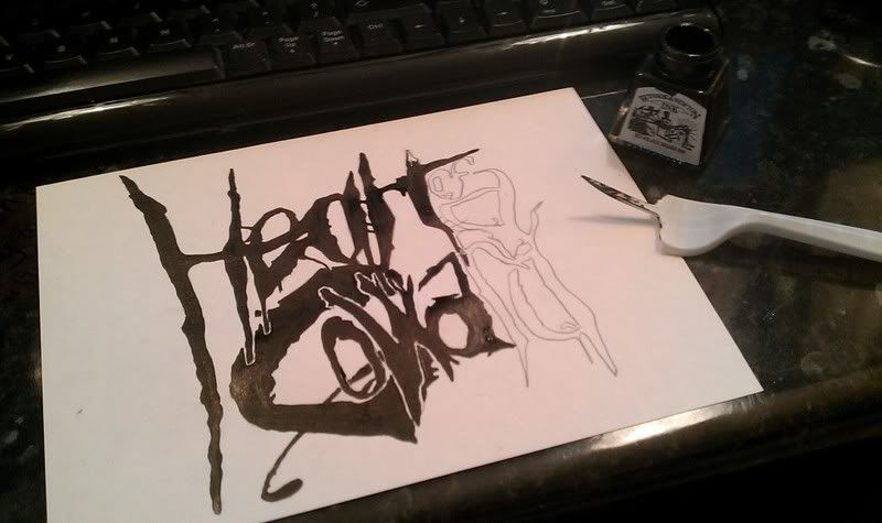
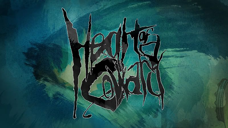
Wouldn't so much say Final Image for now but I'm close. Ignore the background by the way, I just quickly threw it together to help show the idea, this won't be used in the final comp.

No comments:
Post a Comment